On the banks of the Douro, where tradition and innovation intertwine, the new visual identity of the Menin Douro Estates wine range is born. A project that honours the region’s roots while reinterpreting them through a contemporary, elegant, and intentionally minimalist visual language.
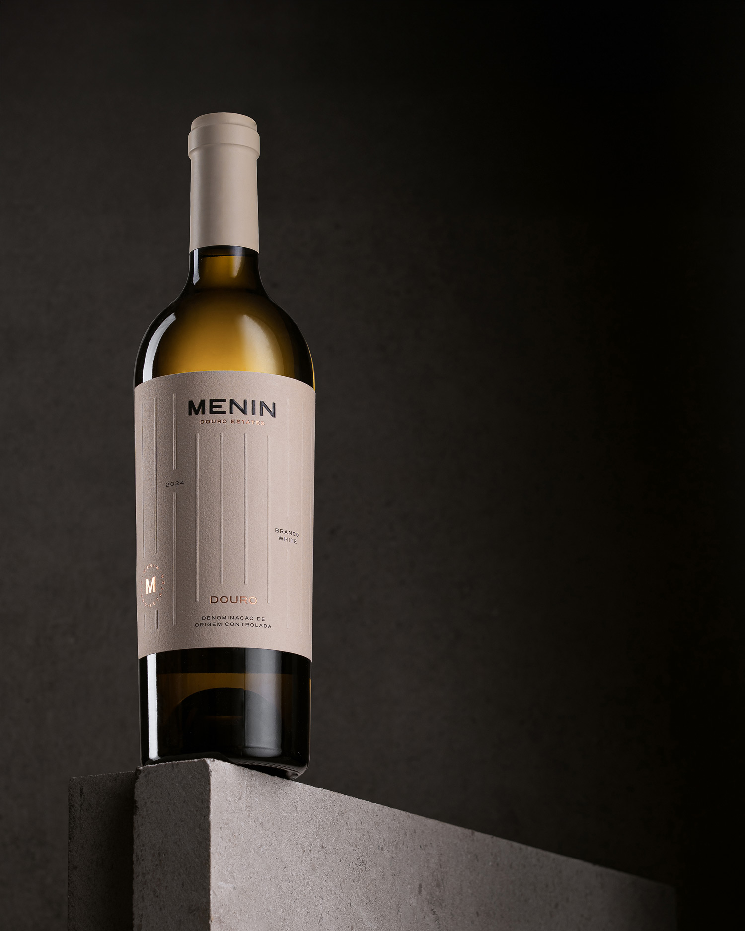
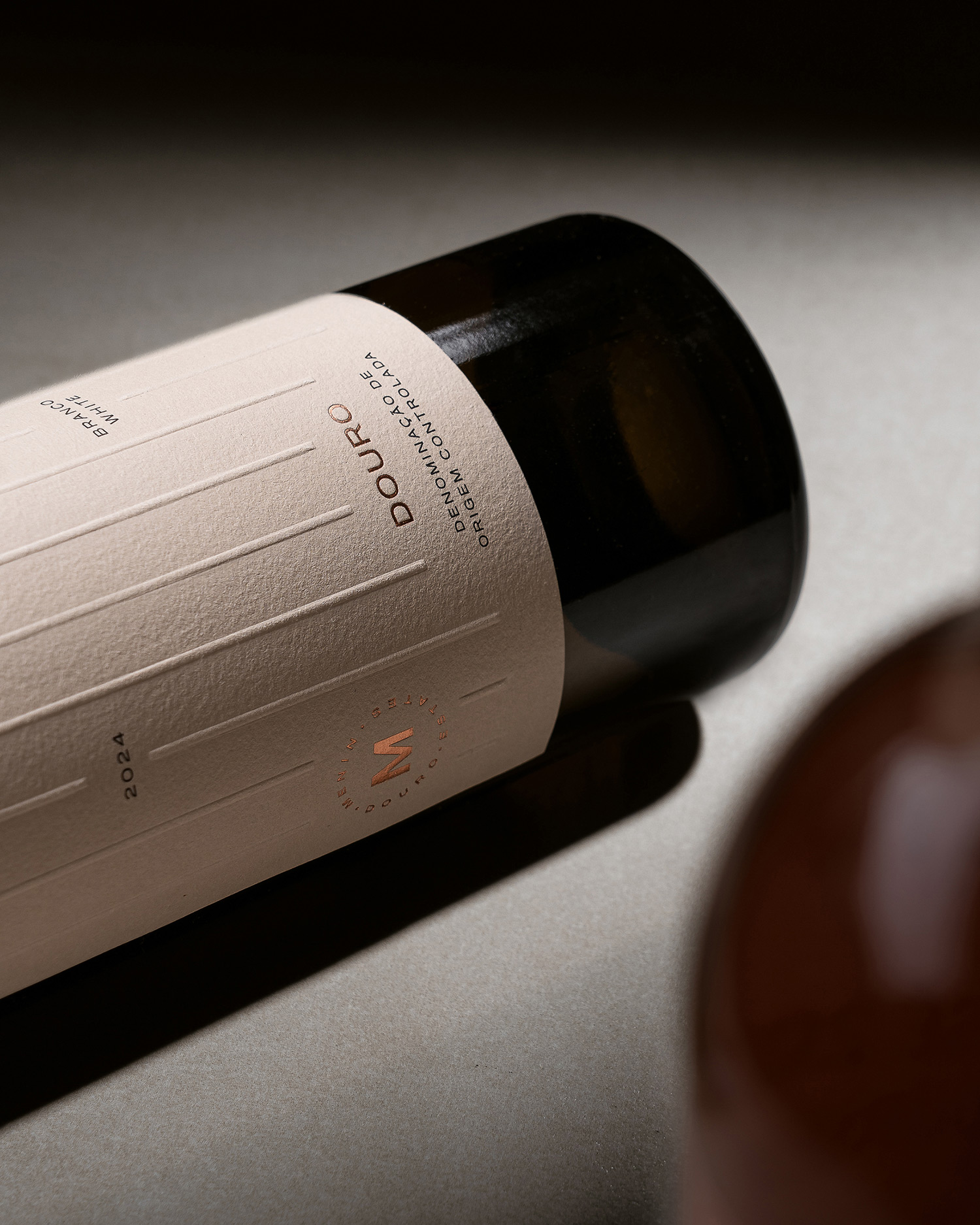
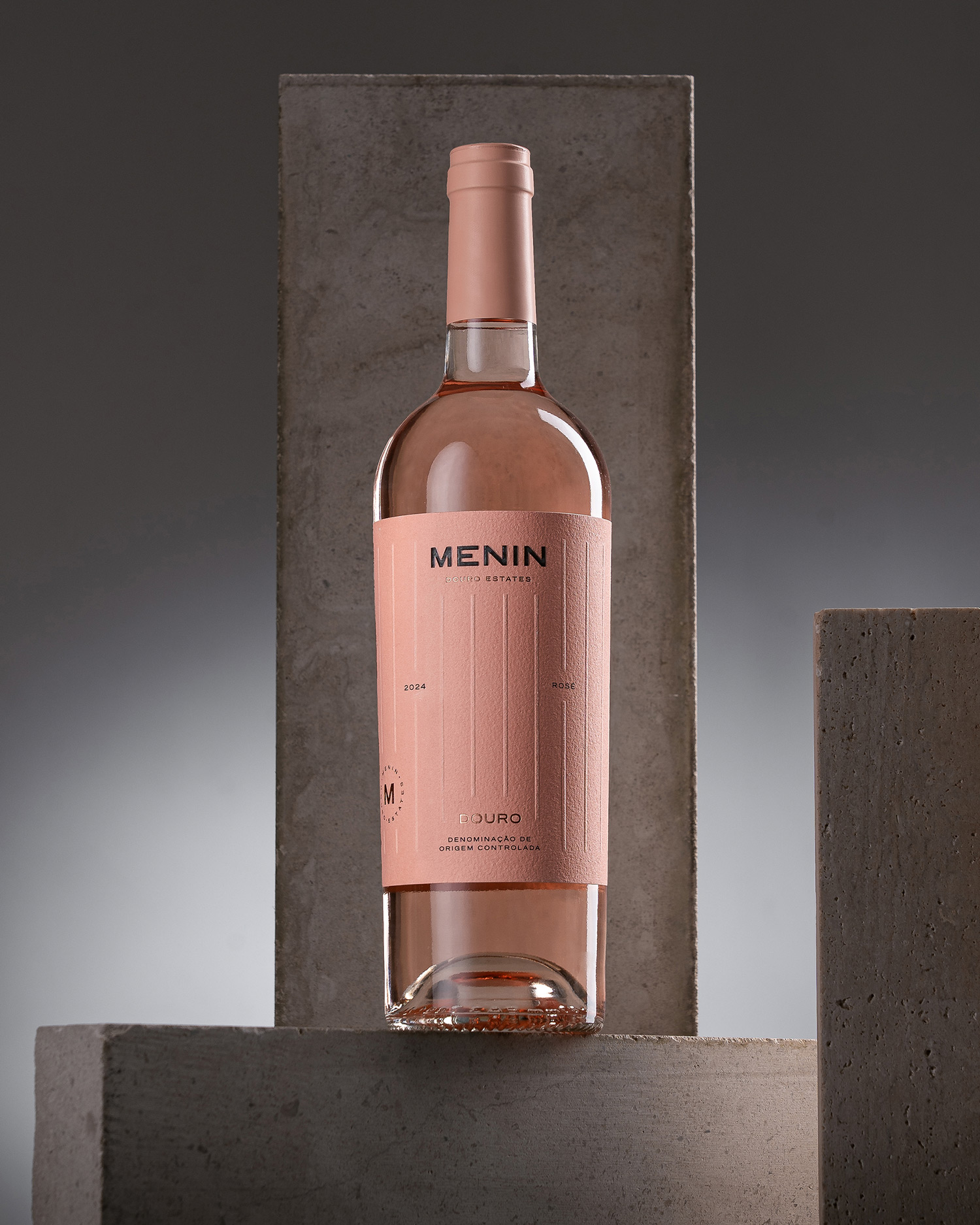
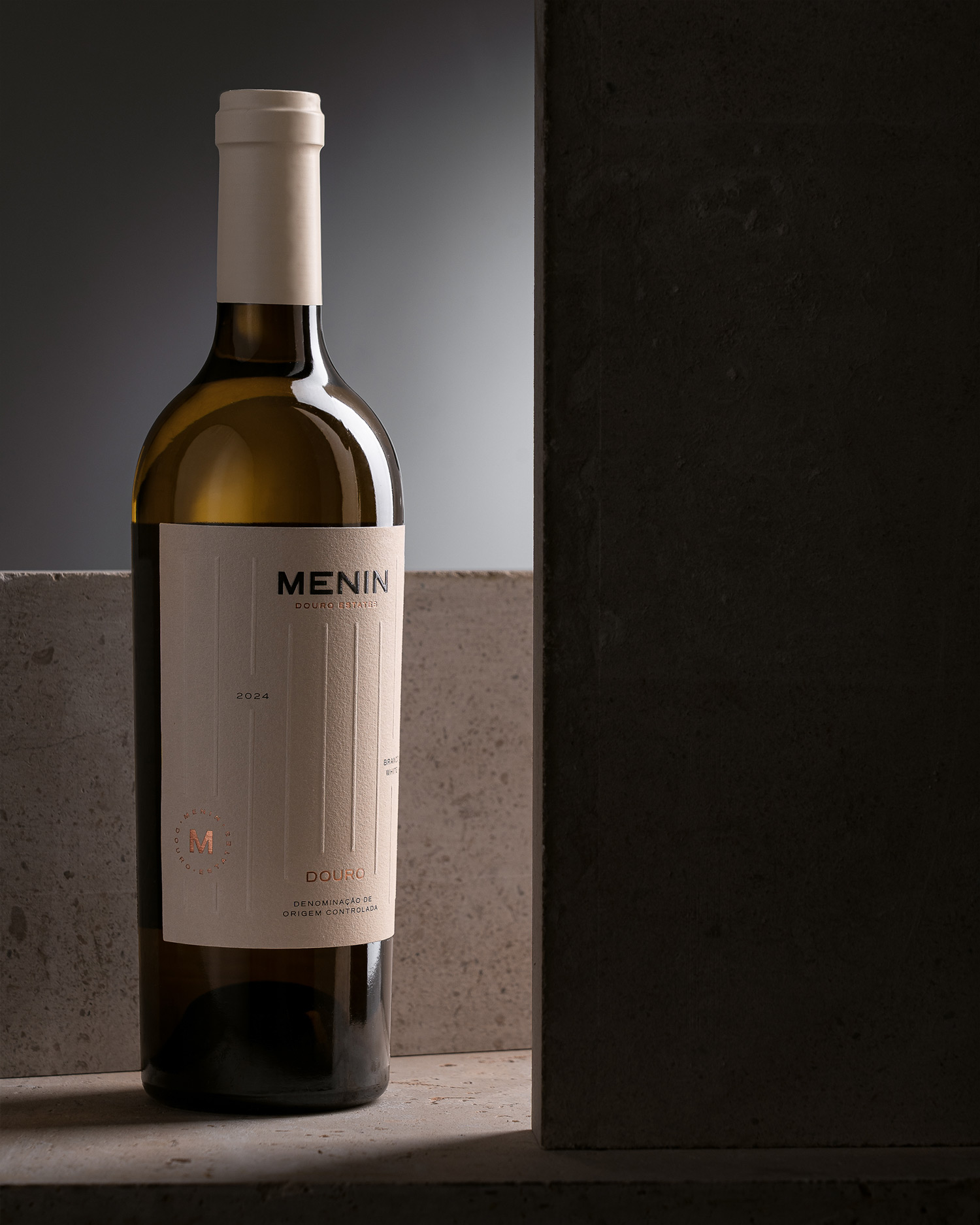
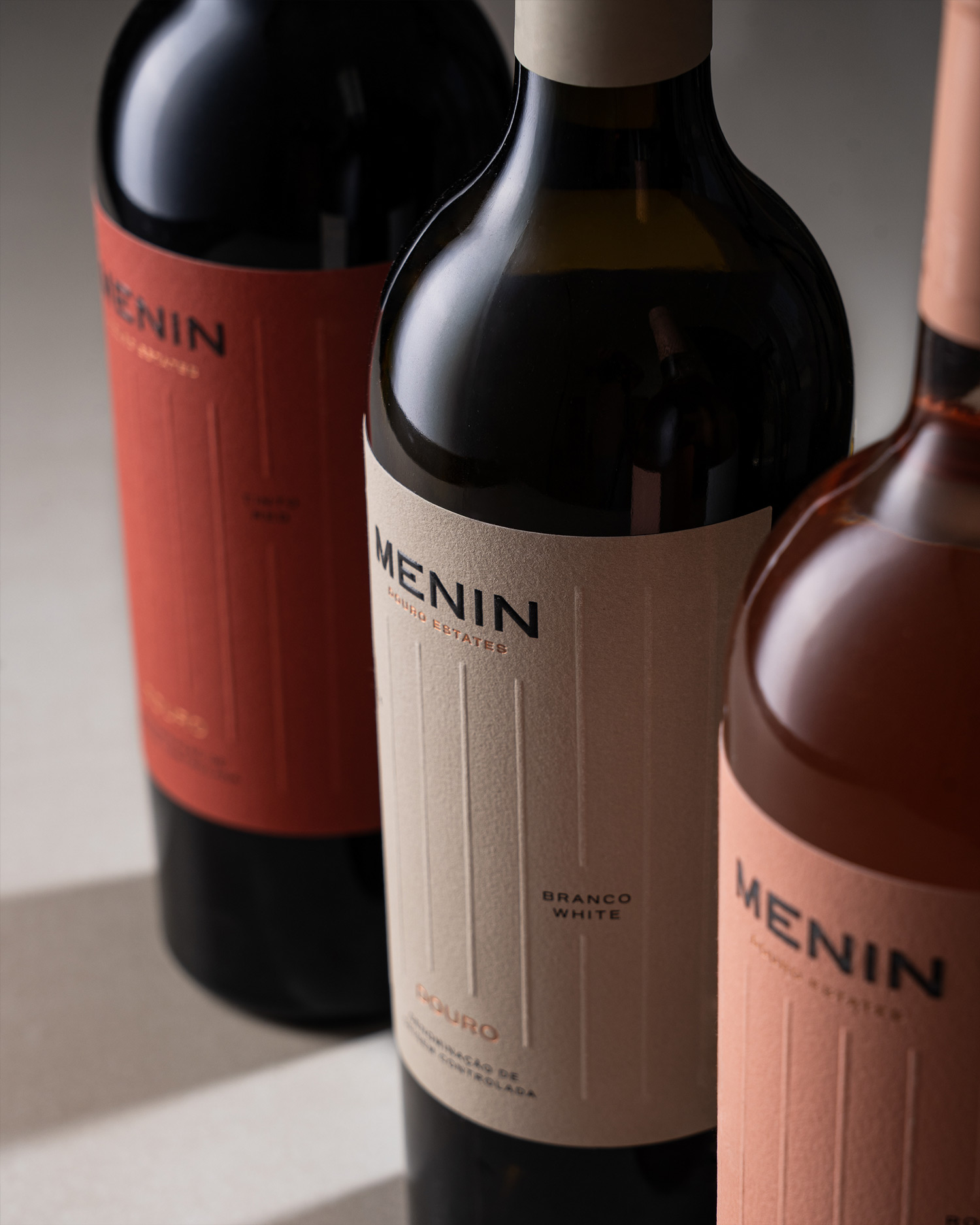
The creative starting point was an aerial view of the Douro vineyards. The geometry of the terraced landscape, precise, almost architectural, inspired the graphic composition of the labels. Vertical parallel lines, replacing the traditional curves that usually represent the terrain’s flow, evoke the human effort, meticulous planning, and dedication behind every bottle of Menin. This visual system conveys order, elegance and balance, reflecting the character of the wines themselves. A refined aesthetic that reveals more by showing less, creating space for what truly matters.
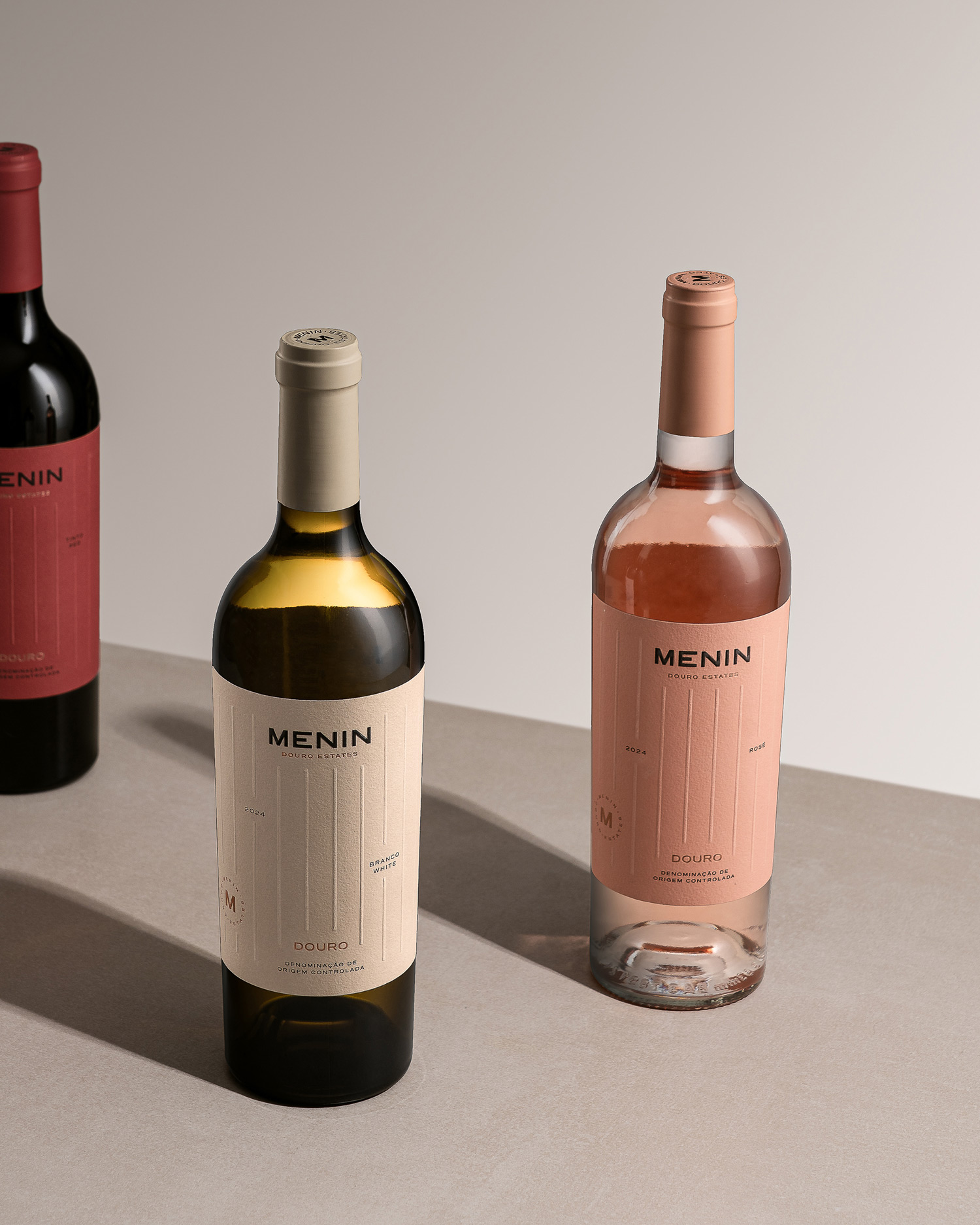
Available in Red, White and Rosé, Menin wines share a unified visual identity, with subtle colour variations distinguishing each reference. Embossing details, hot foil and cotton paper enhance the brand’s premium positioning without resorting to the obvious.
More than a visual update, this design represents a clear statement: Menin is tradition reimagined with boldness, authenticity wrapped in modernity. It’s an invitation to savour the Douro slowly, with pleasure, whether at the table, in a toast or in a quiet moment of reflection.